
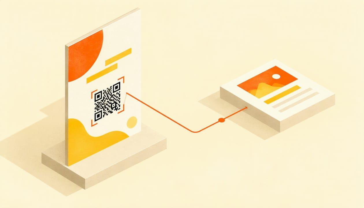
An event poster QR code works when it opens a fast, mobile-friendly ticket or event page, sits at a readable height, is printed large enough for the distance people will scan from, and has a short line of text telling people what they get. Get those four things right and the poster becomes a direct path from a passer-by to a ticket sale. Get one wrong and the code is just decoration.
This guide walks through the whole job: creating the code, choosing the destination, sizing and placing it, printing it, testing it, and keeping it working after the posters are up.
TL;DR
- Link the code to one mobile-optimized page, ideally your ticket page, with date, time, venue and a single clear action.
- Put a short call to action beside it, such as "Scan to buy tickets," and print the short web address underneath as a fallback.
- Size it with the 10:1 rule: the code's width should be at least one-tenth of the scanning distance.
- Keep dark-on-light contrast, leave a four-module empty margin, and skip glossy lamination.
- Test a full-size print proof on iPhone and Android in the light where the poster will hang.
Table of Contents
- How to create a QR code and add it to a poster
- What the QR code should link to
- Tell people what they get before they scan
- Size: use the 10:1 rule
- Placement: where on the poster
- Make it scan: contrast, margin and print finish
- Test the proof, not the screen
- Static or dynamic: choose before you print
- Keep the poster trustworthy
- Perspective
- Put the poster, page and tickets in one place
- After the poster is up
- A pre-print checklist
- FAQ
- Sources
How to create a QR code and add it to a poster
The process is the same whether you design in a template tool or in a professional layout program. Here are the steps in the order that saves you reprints.
- Finish the destination page first. The code is only as good as the page behind it. If your ticket page is not live, build it before you design anything. A code that points to a placeholder cannot be fixed on paper.
- Copy the exact final URL. Use the canonical link to your ticket page. Paste it into the generator without edits, and read it back character by character.
- Decide static or dynamic. A static code stores the address in the pattern itself. A dynamic code stores a short link that a provider redirects. More on this choice below.
- Generate the code as a vector file. Choose SVG or PDF output rather than a small PNG. Vector files keep the square edges sharp at any poster size, which is what print reliability depends on.
- Place it in your layout with its margin. Drop the code onto a solid light area, add the call to action and the short URL, and keep everything else out of the margin.
- Print a proof at real size and scan it. Only then send the file to the printer.
If you are still designing the poster itself, our guide to event poster design with AI or templates covers layout, hierarchy and the three-second test that tells you whether the message lands before anyone gets close enough to scan.
What the QR code should link to
Link to the page where the next step happens. For most organizers that means the ticket page or an event landing page. Research from print and QR providers is consistent on this: a poster code can open ticket or event details, and the page should be mobile-friendly.

One practical recommendation comes from a QR platform's guide to event codes: the code should open a mobile-optimized event page showing date, time, venue and one clear action, such as Register or Get Tickets, not a social media event or a desktop-formatted registration form. That matches how people behave. They scan standing up, on a phone, often with one hand and a few seconds to spare.
What the landing page needs
- The event name, date, start time and venue above the fold.
- One button: buy tickets, register or RSVP. Not three.
- Fast loading on mobile data. Compress images and avoid auto-playing video.
- Readable text without pinching and zooming.
- Answers to the usual questions nearby, such as accessibility, parking, age limits and refunds. Our guide to the event FAQ page shows what to include.
If you are building the page from scratch, how to create an event website that sells tickets takes you through the pieces in order. For design and accessibility choices, see our piece on event website design.
Should the code go straight to checkout?
Send people to the event page with a visible ticket button rather than dropping them into a blank checkout. They want to confirm what, when and where before paying. The exception is a sold-out-style fundraiser or a single-ticket-type event, where the ticket page and the event page can be the same thing.
Tell people what they get before they scan
A bare square gives nobody a reason to lift a phone. Every code needs a short, action-led label next to it. Guides from QR providers agree on the formula: something like "Scan to buy tickets" or "Scan to RSVP" signals what the link does.
One design guide reports that unlabeled codes can draw a fraction of the scans of labeled ones, and recommends a "Scan to [verb]" pattern over vague labels such as "Scan me." Treat the exact multiple as an operator-reported figure, but the direction is easy to believe: people scan when they know the payoff.
A print retailer's event guide adds that a clear payoff, such as a discount or early access, plus a fast mobile page, gives people a reason to act. For organizers that suggests a few strong lines:
| Event type | Caption that works | Why |
|---|---|---|
| Concert | Scan to get tickets | Names the outcome |
| Charity gala | Scan to reserve your table | Specific and urgent |
| School open day | Scan to book your visit | Gives a clear next step |
| Workshop | Scan to save your seat | Implies limited places |
| Sports tournament | Scan to register your team | Speaks to the right person |
| Early-bird push | Scan for early-bird tickets | Adds a reason to act now |
If you run discounts, the caption can promise them, and the page can accept a code. Our guide to promo codes for events covers types and setup.
Print the web address under the code
Add a short, readable URL below the square. It gives people a trusted fallback if they cannot scan, if the phone struggles to focus, or if they simply want to check where the link goes. It also lets someone type the address later from memory. Keep it short and clean: use a tidy path on your own site rather than a long string of parameters.
Size: use the 10:1 rule

The most repeated sizing rule is simple. The code's width should be at least one-tenth of the distance people will scan from. At two meters, that is 20 cm. Another guide gives the imperial version: a code scanned from 10 feet needs to be at least 12 inches wide.
That is a minimum. Use the table as a starting point, rounding up.
| Where the poster hangs | Typical scan distance | Minimum code width |
|---|---|---|
| Handheld flyer or table card | 1 ft | 1.2 in |
| Notice board, café window, hallway | 3 ft | 3.6 in |
| Shop window or lobby wall | 5 ft | 6 in |
| Poster seen from across a room | 10 ft | 12 in |
The figures follow the 10:1 ratio, with the 12-inch value coming from the source above. Larger is always safer, and a code on a poster can occupy a quarter of the sheet without feeling cramped if the rest of the layout is disciplined.
Be honest about distance
Most failed posters fail here. Designers imagine people standing in front of the poster. In reality, a poster on a street pole is read while walking, and nobody is going to stop in a traffic lane. Decide where scanning will really happen. If the answer is "at a bus stop, standing" the distance may be 3 to 5 feet. If it is "on a pole," the code probably does not belong there, and the poster should lead with the web address and a short memorable phrase instead.
Placement: where on the poster
Place the code between roughly waist and eye height once the poster is hung. That is where a person can hold a phone steady without craning. In practice:
- Lower right or lower center of the poster usually works, because the eye finishes there after reading the headline, date and venue.
- Do not hang the poster so high that the code sits above a normal reach. On a tall poster, the layout might need the code in the middle rather than the bottom.
- Keep it away from folds, staples and tape. Creases through the pattern can break a scan.
- One code per poster. Two codes force a decision and halve the clarity.
- Put the headline, date and venue first. The code supports the message. It does not replace it.
For the rest of the design hierarchy, including how to use AI to generate the artwork, see our poster design guide.
Make it scan: contrast, margin and print finish
Contrast
Use a dark code on a light background. Black on white is the safest option. Brand colors can work when the contrast is strong, but inverted codes (light on dark) and low-contrast tints are a common reason a code fails on some phones. Do not place the code on top of a busy photo.
The quiet zone
Every code needs an empty margin around it, called the quiet zone. The standard requirement is four modules wide on every side, where a module is one of the small squares that make up the pattern. A designer's guide notes that text, frames, photos or the poster edge intruding into that zone can stop a code reading altogether. Measure one square in your final artwork and multiply by four.
Print finish
Print from vector files to keep edges sharp, and avoid glossy lamination, which creates glare under shop lights and sunlight. A matte finish is kinder to phone cameras.
Do not decorate the code
Logos in the center, rounded dots and gradient fills look good on screens and can reduce reliability in print. If you want a branded code, test it on a real print before you commit, and keep the standard pattern if any phone struggles.
Test the proof, not the screen
A code that scans on your monitor can fail on paper. Testing should happen on a full-size print proof, on both iPhone and Android, in the light where the poster will hang. Here is a checklist you can run in ten minutes:
- Print the poster at final size, even if you have to tile it.
- Tape it to a wall at the intended height.
- Scan from the real distance, not from arm's length.
- Try at least two phones, one of each major operating system, and an older model if you can borrow one.
- Scan in daylight, under indoor lighting and in the dimmest light you expect.
- Check that the page opens quickly on mobile data, not just Wi-Fi.
- Walk the whole path: scan, read, tap the ticket button, reach checkout.
- Ask someone who has never seen the poster to scan it and say what they expected to happen.
The last two catch problems that technical scanning does not.
If it will not scan
Work through the common causes: low contrast, a squeezed quiet zone, a typo or dead link in the URL, blurry printing, glare from lamination, or a code too small for the distance. Nine times out of ten the fix is to enlarge the code or clear its margin.
Static or dynamic: choose before you print
The difference matters because posters are permanent and links are not.
A static code stores the content in the pattern itself, so it keeps working with no account or provider. A dynamic code stores a short link that a provider redirects to your destination, so it works only while that provider keeps redirecting. The same source notes that many providers stop when a trial ends or a plan lapses. A poster that outlives a subscription then leads nowhere.
Dynamic codes do have uses. They let you edit the destination and compare scan counts, which can help if you are running two poster versions or want to change the link after printing. If you go that way:
- Use your own domain for the short link where the provider allows it, so you control where it points.
- Confirm in writing how long the code stays active and what happens when the plan ends.
- Know that providers can log IP addresses, user agents and timestamps. Under privacy laws such as GDPR, scan logs can count as personal data, so ask providers how long they keep raw IP addresses and where data is processed.
The simplest robust option for most organizers is a static code pointing to a URL on a domain or site you control. If the final page ever changes, redirect that address to the new one.
Keep the poster trustworthy
People have learned to be wary of codes on printed material. The FTC has published a consumer alert about QR codes arriving unexpectedly on packages, and that caution carries over to street posters. Help people trust yours:
- Show your event name, organizer name and web address clearly beside the code.
- Use the same brand, colors and wording on the poster as on the landing page.
- Check regularly that no one has stuck a sticker over your code on posters in public places.
- Use a clean short address people can read.
Perspective
Posters are where most local events are won or lost, and the QR code is the bridge between a glance and a sale. We built Actickety around a simple idea: your event, your revenue, your rules.
That is why we think the code should lead to a page you own. When the ticket page is the event's own microsite, the poster, the page and the checkout all carry your brand, and you keep 100% of your event data. We do not charge platform fees on ticket sales, so the people who scan are buying from you, not feeding a middleman.
Our advice is to build the page before the poster, make it do one job, and let the QR code point straight to it. Ten straightforward steps get you a site, an AI-generated poster and ticketing in one place, with zero upfront costs until you are ready to go live.
Tim
Put the poster, page and tickets in one place
If you are juggling a poster tool, a website builder and a ticketing service, the QR code becomes the weak link: three logins, three places to update. With Actickety you can build a professional event microsite, generate an AI poster and set up ticketing and merchandise in one flow, with no upfront cost until you go live. Because the ticket page is part of your own microsite, the address on your poster is one you control.

Start on the Actickety home page and build the page your poster will point to. Once tickets are live, our guide on QR codes for tickets shows how to set up and scan the codes attendees will carry in.
After the poster is up
A poster is one touchpoint. Use the same link and caption everywhere so the message stays consistent:
- Post the poster image on social media with the ticket link in the bio or story. See our guide to Instagram event promotion.
- Put the same code on handbills and table cards, sized for the shorter distance.
- Track which posters bring sales by giving each location its own tagged link, or by using a promo code per venue.
- For wider tactics, read how to increase ticket sales.
- If your event is local and community-driven, see community event ticketing for a fast launch.
And if you want the page to carry your own brand rather than someone else's, our guide to white label ticketing explains the options.
A pre-print checklist
Before you send the file to the printer, confirm each of these:
- The URL is final and tested on mobile.
- The caption names the action and the benefit.
- The code is at least one-tenth of the real scan distance in width.
- Four modules of empty space surround it.
- Dark code, light background, no busy image behind.
- The short URL is printed beneath it.
- The proof scanned on two different phones at the real distance.
- You chose matte stock or no lamination over the code.
- You know who owns the code's destination and for how long it will work.
FAQ
Can I use the same QR code on every poster?
Yes, if every poster has the same goal. To see which locations perform best, add a tagged link or a separate promo code for each venue, or use a different code per batch. Remember that each code should still follow the same size and margin rules.
What size should a QR code be on an A3 or tabloid poster?
The size depends on the scanning distance, not the sheet. Apply the 10:1 rule: for a scan from 3 feet, the code should be at least 3.6 inches wide. On a tabloid-size poster, a code of 3 to 4 inches typically fits comfortably, but only if people will be close. For longer distances, make it bigger.
Should I use a free QR generator?
A free static generator that gives you a vector file is enough for most posters, because the code never depends on the provider. Be careful with free dynamic codes, which can stop working when a trial or plan ends. Whatever you use, test the printed proof before the full run.
What should the QR code say if people can't scan it?
Print the short web address under the code, with a line such as "or visit actickety.com/your-event." Replace the example with your real address. This lets anyone type the link, and it reassures people about where the code goes.
Sources
- QR Codes for Events and Posters: Sizing, Placement, Testing
- QR Code Poster: Use Cases, Tips, and Perks | Bitly
- QR Codes for Events: Every Use Case from Flyer to Conference
- QR Code on Flyers & Posters: The Design Guide That Converts
- How to Use Event QR Codes | VistaPrint US
- QR Code for Posters: Size, Placement & Print Guide
- QR Code Quiet Zone: 4-Module Margin and Design Rules
- QR code size on poster: scan distance math | Voqado
- QR Code Not Working? Fix It Fast | QRocket
- Dynamic vs Static QR Codes: What If You Stop Paying? | QRdx
- Dynamic QR codes and privacy: what every scan reveals
- Scam alert: QR code on an unexpected package | FTC