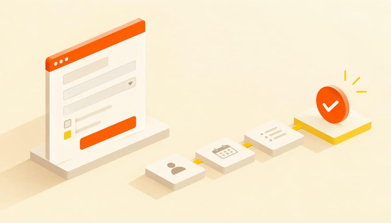
To take seminar registrations online, you need one page that says what the seminar is, who it is for, when and where it happens, and a short form that ends in a confirmation email. Build that page first, keep the form to the fields you will actually use, and send every promotion to it. This guide walks through each part in order, from the page layout to the form fields, payments, confirmations and tracking.
TL;DR
- Build one dedicated seminar page with a visible register button above the fold, and point every email, post and flyer to it.
- Ask only for what you need: name and email for a free seminar, a few extra fields for paid or in-person ones.
- Free seminars need a ticket price of zero and an instant confirmation; paid ones need a payment step and a receipt.
- Send a confirmation immediately and reminders before the day, and check mobile and accessibility before you publish.
- Add tracking before you promote, so you can see which channel produces registrations.
Table of Contents
- What a seminar registration page needs to do
- Step 1: Decide the basics before you build
- Step 2: Build the landing page around visitor decisions
- Step 3: Choose what the registration form asks
- Step 4: Handle free and paid registration
- Step 5: Confirmation and reminder emails
- Step 6: Check mobile and accessibility before you publish
- Step 7: Promote the page and track registrations
- A quick pre-launch checklist
- Build your seminar page with Actickety
- FAQ
- Sources
What a seminar registration page needs to do
A registration page has one job: help a stranger decide quickly and sign up without friction. That means the page is designed around the visitor's questions, not around the order in which you would present the seminar on stage.
The guidance from event-page specialists is consistent on the questions. One marketing guide says every event page must answer five: what is it, why should I attend, when and where is it, who is presenting, and how do I register. If a visitor can answer all five in about ten seconds, the page is doing its work.
This is also what people mean when they search for a seminar landing page. It is not a separate thing from registration. It is the page that holds the registration form, and the better it explains the seminar, the fewer people abandon the form.
Step 1: Decide the basics before you build
Before opening any tool, settle the facts the page will carry. Write them in a short note you can paste from.
- Format. In person, online, or both. An online seminar needs a meeting link delivered after registration; an in-person one needs a venue and, often, a capacity.
- Date, time and time zone. State the time zone if any attendee could be elsewhere. For online seminars, note whether a recording will be sent.
- Audience. One sentence on who it is for and what they will be able to do afterward.
- Price. Free, paid, or tiered (for example members, students, general). If paid, decide on refunds and transfers now, not after the first email arrives.
- Capacity. A cap creates natural urgency and keeps you inside venue or platform limits.
- Host details. Speaker names, short bios and a photo.
These six items become the page copy, the form logic and the confirmation email. Deciding them first saves rewrites.
Step 2: Build the landing page around visitor decisions
One event landing page guide recommends six sections in a set order: the invitation, who it is for, what happens, who is hosting, the registration step, and practical answers. That order mirrors how a reader thinks: Is this for me? What will I get? Who is behind it? How do I join? What else do I need to know?

The first screen
Another builder guide says the first screen should show who the seminar is for, the practical outcome and the next step, with a single main call to action, one trust cue and one low-friction secondary action. An optimization guide puts it as four things visible before scrolling: the event name with a one-line description, the exact date, the place (city, venue or "Online"), and a registration button.
Put together, a strong top of page looks like this:
- A headline naming the outcome, not just the topic: "Write a grant application that gets read" beats "Grant Writing Seminar".
- A line with date, time and location.
- A button reading "Register now" or "Reserve my seat", with price context nearby ("Free" or the ticket price).
- One trust cue, such as a speaker's credential or the number of people who attended last time, if you have it.
The sections below
Under the first screen, work through the rest in this order:
- What happens. A simple agenda with times. People register faster when they can picture the session.
- Who is hosting. Names, photos and one line of relevance each.
- Proof. Testimonials, past attendee numbers or logos of organizations that attended, only where they are real.
- Practical answers. Parking, accessibility, recordings, refund terms, what to bring.
- A second register button. The same button, repeated near the end, so the visitor never has to scroll back up.
If you want a deeper walkthrough of building the page itself, our guide on creating an event website that sells tickets covers the layout in detail, and the piece on event website design covers accessibility and clean design choices.
Step 3: Choose what the registration form asks
Every extra field costs you registrations. The same builder guide argues that form friction kills intent quickly and that qualification should be progressive rather than front-loaded: ask for the minimum first, collect the rest later by email.
The Singapore marketing guide notes that free webinar sign-ups typically need only a name and email, while paid conference registrations may require more. That is a good rule of thumb for seminars too.
| Field | Free online seminar | Free in-person seminar | Paid seminar |
|---|---|---|---|
| Full name | Yes | Yes | Yes |
| Yes | Yes | Yes | |
| Organization or job title | Optional | Optional | Optional |
| Phone number | No | Only if the venue needs it | Optional |
| Dietary or access needs | No | If you serve food or need to plan access | If relevant |
| Billing details | No | No | Yes, through the payment step |
| Number of seats | Optional | Yes, if people bring guests | Yes |
| Consent to be contacted | Yes, if you will email about other things | Yes | Yes |
Questions worth adding
Add a field only if you will use the answer before or at the seminar. Good candidates:
- A single open question, such as "What would you most like covered?" It gives you content for the session and makes attendees feel heard.
- Access needs, so you can arrange seating, captions or materials in advance.
- How they heard about you, a dropdown with four or five channels. It is a cheap way to see which promotion works, alongside the tracking described below.
Consent and privacy
Tell people plainly what you will do with their details. Use an unticked checkbox for any optional marketing emails, written in plain language, and say whether anyone else will receive the data. If you will email people about future events, say so at the point of sign-up rather than burying it. Link a short privacy policy beneath the form.
Step 4: Handle free and paid registration
Free seminars
A free seminar still benefits from a ticket flow. One events guide describes the approach: set the ticket price to zero, let registrants complete the form without paying, and have registrations go straight to confirmed. This gives you a headcount and a contact list without any payment friction.
Free does not mean no-shows are impossible. People who pay nothing often forget, so reminders matter even more (see below). Some organizers cap free seats and keep a waitlist for exactly that reason.
Paid seminars
For a paid seminar, the registration form should lead into payment on the same flow, and the buyer should get a receipt or invoice immediately. The same guide suggests attaching a receipt or invoice PDF for paid events.
Keep pricing simple. One or two ticket types are easier to understand than five. If you offer an early rate, describe it by the cutoff condition on your own page and update it when it ends, rather than leaving an expired offer sitting live.
Our step-by-step guide on how to sell event tickets online goes through payment setup in more detail, and if your seminar is held on video, virtual event ticketing covers fees, access and setup for online sessions.
Step 5: Confirmation and reminder emails
The confirmation email is the last step of registration, and attendees treat it as proof they are in. Send it instantly. According to the events guide, a good confirmation includes:
- The event name
- Date and time
- The location, or the virtual meeting link
- The ticket type
- A QR code for check-in
For paid seminars, add the receipt.
The same source describes reminder emails scheduled at set intervals, for example 7 days, 1 day and 1 hour before a webinar. You do not need to copy that exact schedule, but the pattern is sound: one reminder a week out that restates the value, one the day before with logistics, and one shortly before the start with the link or directions.
Write these emails in the same voice as your page. Keep each to one purpose and one action. We cover the six messages worth automating in our guide to event email marketing.
Step 6: Check mobile and accessibility before you publish
Many visitors will arrive from a phone, from an email or a social post. Open your page on a phone and run through the whole journey: read the headline, tap the button, fill in the form, pay if needed, receive the email. If any step needs pinching or zooming, fix it.
Accessibility is part of the same check, and it also helps everyone. Accessible registration forms need:
- A visible label for every field, so screen readers can announce what each box is for
- Enough color contrast between text and background, including on the button
- Descriptive alt text for images that carry meaning
- Clear error messages that say what went wrong and how to fix it
Test by moving through the form using only the keyboard. If you can reach every field and the button in a sensible order, you are most of the way there. Our event website design guide goes deeper on building to WCAG standards without hiring an agency.
Step 7: Promote the page and track registrations
Send every channel to one page. A promotion guide from Kania Marketing advises pointing all promotion back to a single primary page that answers the big questions immediately, and installing analytics before the campaign starts.
Track four things at minimum:
- Page views
- Clicks on the register button
- Completed registrations
- Traffic source, using UTM parameters on each link you share
The same guide recommends watching both early signals (click-through rate, page engagement, email opens) and bottom-line results (registrations, cost per registration, revenue, attendance rate), then adjusting quickly rather than setting a campaign and forgetting it.
A simple reading of the numbers helps you decide what to fix:
| What you see | Likely cause | What to change |
|---|---|---|
| Many visits, few button clicks | The offer or headline is unclear | Rewrite the top of the page around the outcome |
| Many button clicks, few completed forms | The form is too long or confusing | Remove fields, fix mobile layout |
| Plenty of registrations, low attendance | Weak reminders | Add or sharpen reminder emails |
| One channel dominates | Others are underused or poorly linked | Test the weaker channel with a different message |
For the promotion calendar itself, see our event marketing plan timeline, and for social channels, Instagram event promotion shows how to send every format to one ticket page.
A quick pre-launch checklist
Before you share the link, confirm each of these:
- The page states date, time, location or "Online", and price above the fold
- The register button is visible without scrolling and repeated lower down
- The form asks only for fields you will use
- A test registration produces a correct confirmation email
- For paid seminars, a test purchase produces a receipt
- The page works on a phone and with a keyboard
- Analytics and UTM links are in place
- A privacy link sits near the form
If your seminar is a series or a hands-on session, our guide to workshop registration online covers capacity limits and sign-ups that fill.
Build your seminar page with Actickety
If you want the page, the ticketing and the confirmations in one place, that is what we built Actickety for. You build an event microsite in ten straightforward steps, set up ticketing and merchandise, and generate an AI poster for promotion. There are no upfront costs until you are ready to go live, you keep 100% ownership of your event data, and we charge no platform fees on ticket sales.

It suits charities, schools, community groups, small businesses and independent presenters running seminars. You can start from the Actickety home page, or look at Lumina to see what a finished event site can look like.
Our view: your registrations are yours
Most seminar organizers we talk to start the same way: they need a page and a sign-up form, and they end up renting both from a ticketing giant. The page looks like someone else's brand, the attendee list lives in someone else's system, and a slice of every ticket goes to someone who never ran the event.
We think that is backwards. Your crowd is your business. The registration page should look like your seminar, carry your name, and put the attendee data in your hands from the first sign-up.
That is why Actickety lets you build the site yourself, pay nothing upfront until you go live, keep full ownership of your data, and avoid platform fees on ticket sales. Built for organizers, not middlemen.
Start simple: one page, a short form, a clear confirmation. Add the rest as the seminar grows.
Tim
FAQ
How do I set up online registration for a seminar?
Start with a single page that states the format, date, location, price and speakers, then add a short registration form and a confirmation email. Decide whether the seminar is free or paid before you build, since that changes the form and the payment step. Test the whole journey on a phone before you share the link.
What should an online seminar registration form ask for?
For a free online seminar, a name and email are usually enough. Add fields only if you will use them: access needs, number of seats, or one open question about what attendees want covered. Paid seminars also need a payment step, and you can collect anything else later by email.
What should a seminar landing page include?
The top of the page should show what the seminar is, when it is, where it is (or "Online") and a register button. Below that, add the audience, the agenda, the hosts, proof such as testimonials, practical answers and a second register button. Keep one main call to action throughout.
Can I run free seminar registration without taking payments?
Yes. Set the ticket price to zero, so attendees complete the form and are confirmed immediately without paying. Send a confirmation with the date, time and location or link, and schedule reminders, because free sign-ups tend to forget more easily than paying ones.
How do I know if my registration page is working?
Install analytics before you promote, and track page views, register button clicks, completed registrations and traffic source with UTM links. If visits are high but sign-ups are low, simplify the headline or the form. Check again after each promotion push.
Sources
- Event Landing Page: Layout, Example & Launch Checklist
- Conference and Seminar Landing Page Builder Guide
- Event Landing Pages: Drive Webinar & Conference Signups
- Event Landing Page Optimization: 12 Elements That Convert
- Odoo Events Module: Planning, Registration, and Analytics
- How Do You Run a Successful Event Promotion Campaign Online